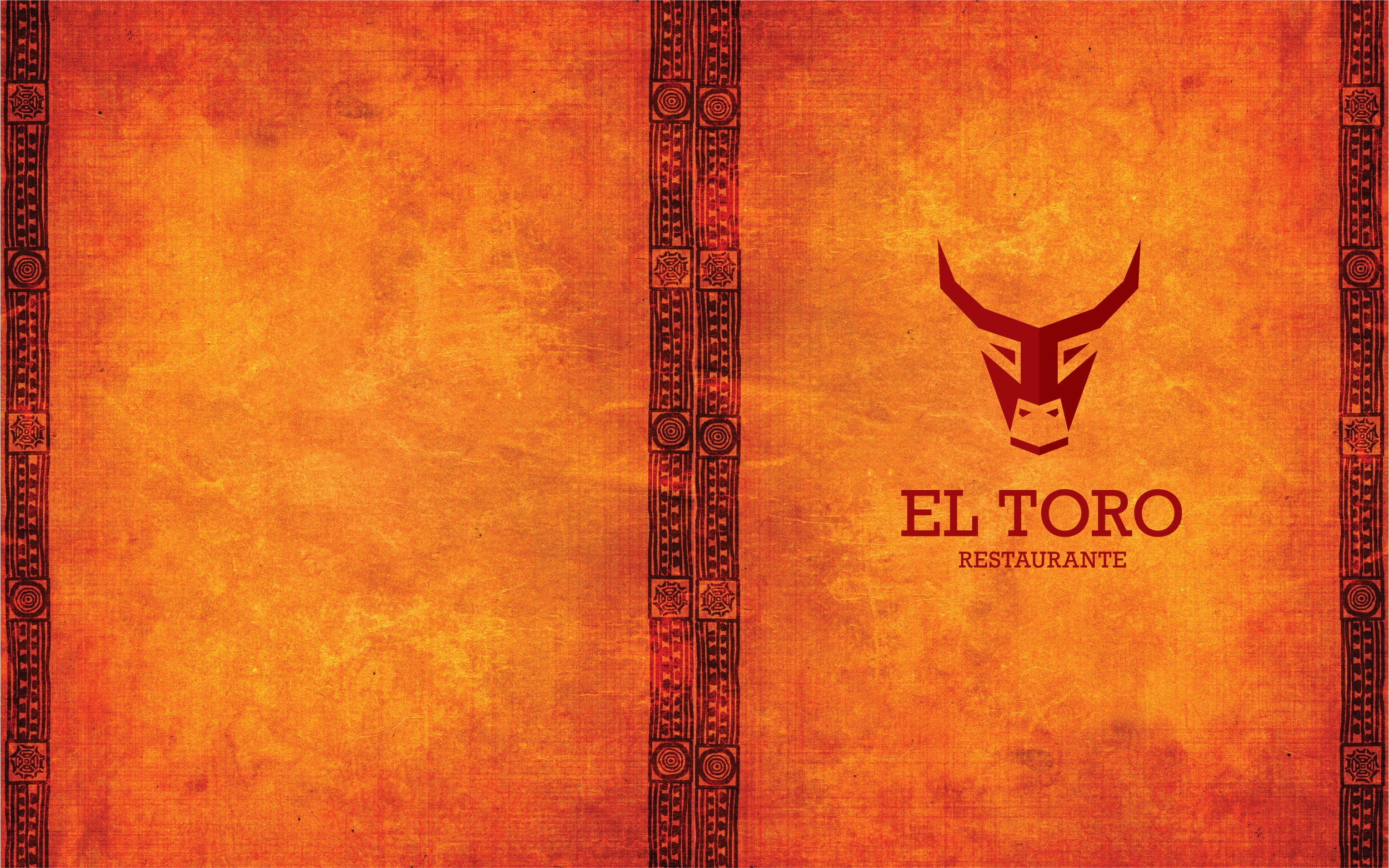
El Toro Restaurante Menu
For the menu list of foods and drinks, the font used is Optima. The bull was used for the Mexican-themed restaurant because bullfighting is a very popular sport there. I went with a geometric style for the logo, making all the lines straight and I used the font Rockwell with the logo for the same reason that it had straight lines. The color red was used because bulls are believed to get agitated and charged when they see it. The cover and interior lines of the menu came from Adobe Stock and are meant to have a Mexican look to them. To make the logo I used the programs Adobe Illustrator for the logo and InDesign for the menu.


